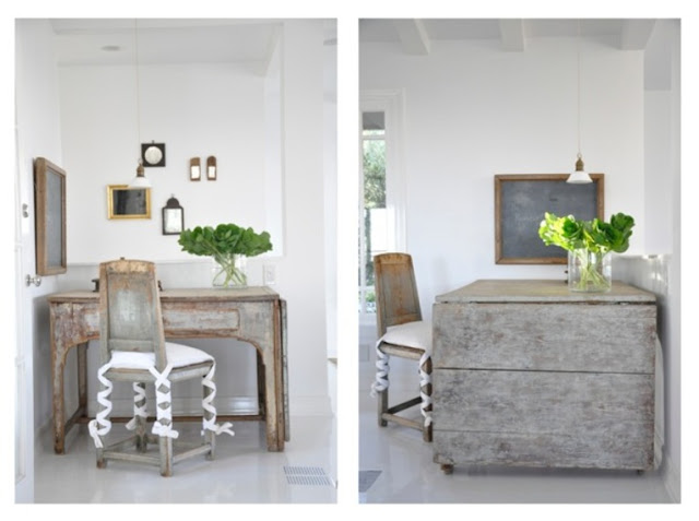
The idea for canvas interiors came very naturally. The look and feel of the store is very authentic and approachable. It is not a formula. It is a reflection of how we feel and how we live. So in the early concepting stages of the store when we came across images that expressed this feeling - it was a breathless finger pointing moment... 'here, here is what it looks like in my head!"
This is one fo those images...
The eye it takes to exercise restraint is apparent in Briggs Edward Solomon's work. It is something we try to do every day on the floor of the store.
These images do not need much commentary as I think his style speaks for itself.
warm texture, clean lines, well curated
These images are from the current issue of Veranda Magazine.
His work embodies every ounce of the vision for our store.
Slipcovers yet clean lines. graphic shapes yet warm wood.
Whimsical touches without being 'cute'. Light, airy and unfussy.
These images make me happy.
I hope they inspire you too.
images 2-11 found: here


No comments:
Post a Comment