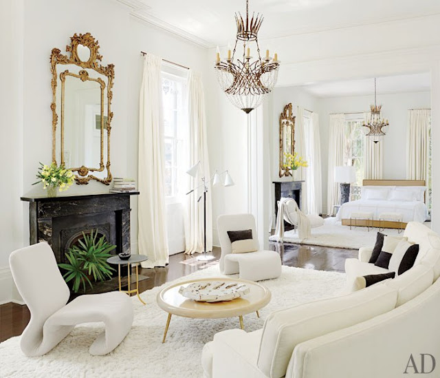
Today I will share with you a home that had me looking at the article in AD twice in great detail. The idea of renovating an historic property always captures my imagination. This reno speaks to me for many reasons. Not the least of which is the white paint used throughout.
Architect and designer Lee Ledbetter set the stage for beautiful natural light by widening many of the 3 foot doorways to 12 feet, allowing light to travel from room to room and creating an open flow. His carefully curated antiques and contemporary pieces all work together to create a dramatic yet inviting space in this circa 1829 home. There is glamour. But there is also the idea of comfort, light and character. All things that appeal to my senses.
a sunny corner
lofty and bright entry, carefully curated for maximum impact
with white as the base, black and grey create quiet drama
dining tables make specific and artful statements
sunny windows make this a perfect reading spot
I would never leave this master bedroom suite
nor would you get me out of the master bath and closet
drama in grey with crisp white - breathtaking
a guest room like no other I've seen
charming exterior ties the impact all together
This home is such a beautiful example of old meeting new and living together beautifully.
While it looks rather glam, there is underlying simplicity here. White paint, clean lines, lots of light and not a lot of clutter... the same thinking that goes into a beach shack can also be applied on the more glamourous scale. Not a lot of pattern, not a lot of wild turns visually.
That is simply glamorous.
You can read the full article here
all images AD


No comments:
Post a Comment